Interiors: Stripe Intentions
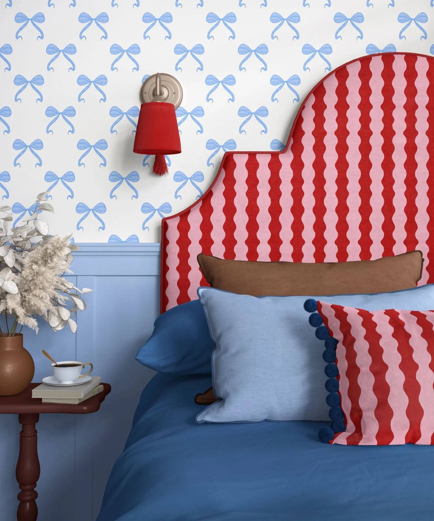
Stripes return every spring, but for 2026 it’s less about the pattern itself and more about how you use it. Think bolder scales, braver colour pairings and a lighter, more playful touch.
Why stripes now?
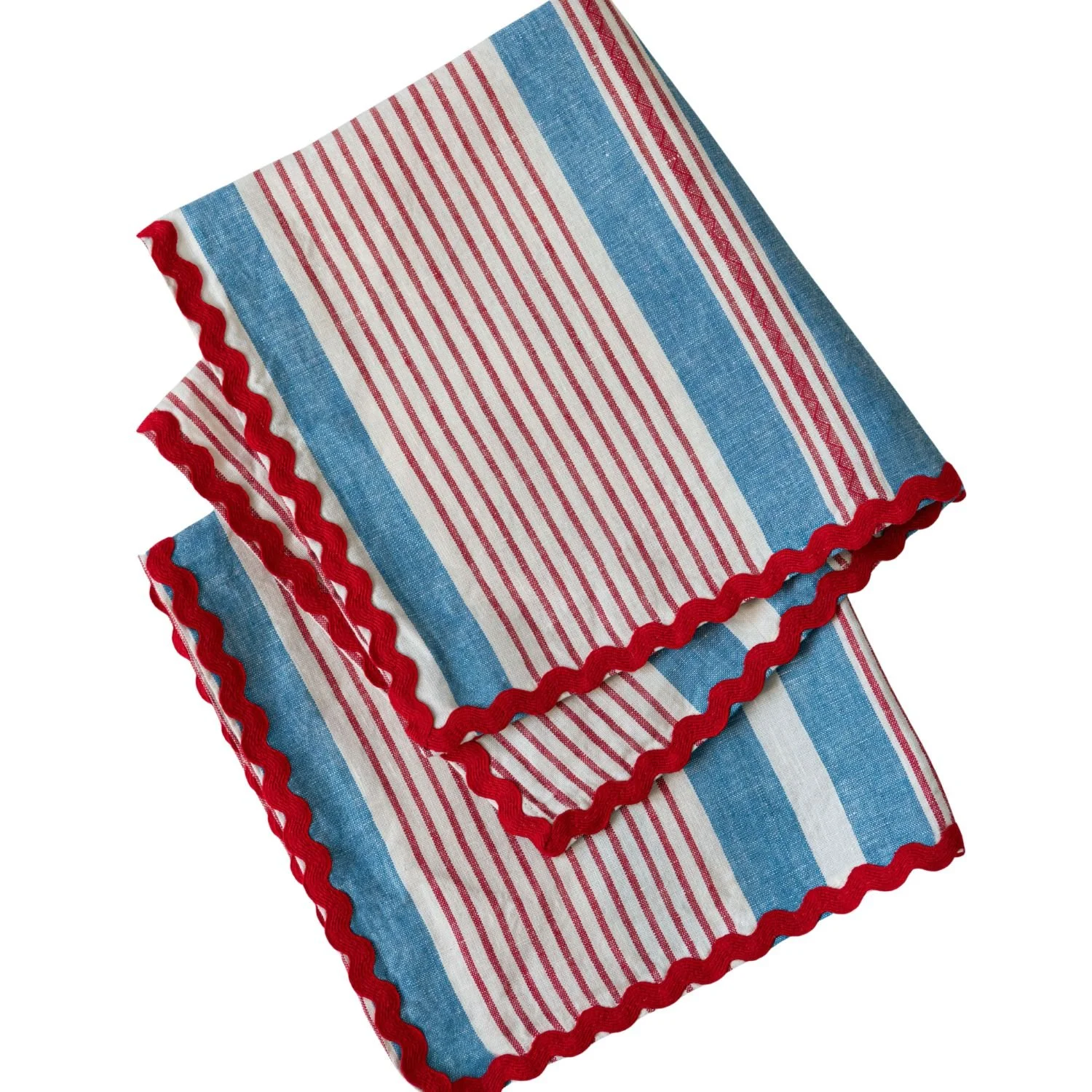
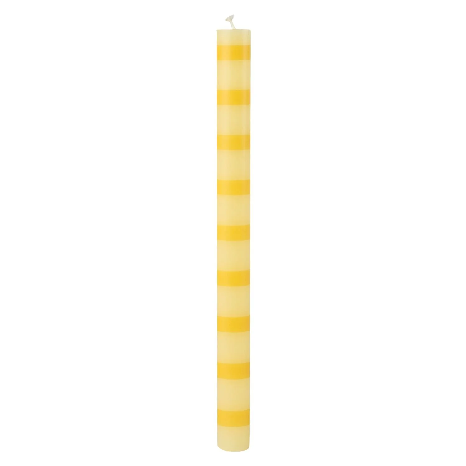
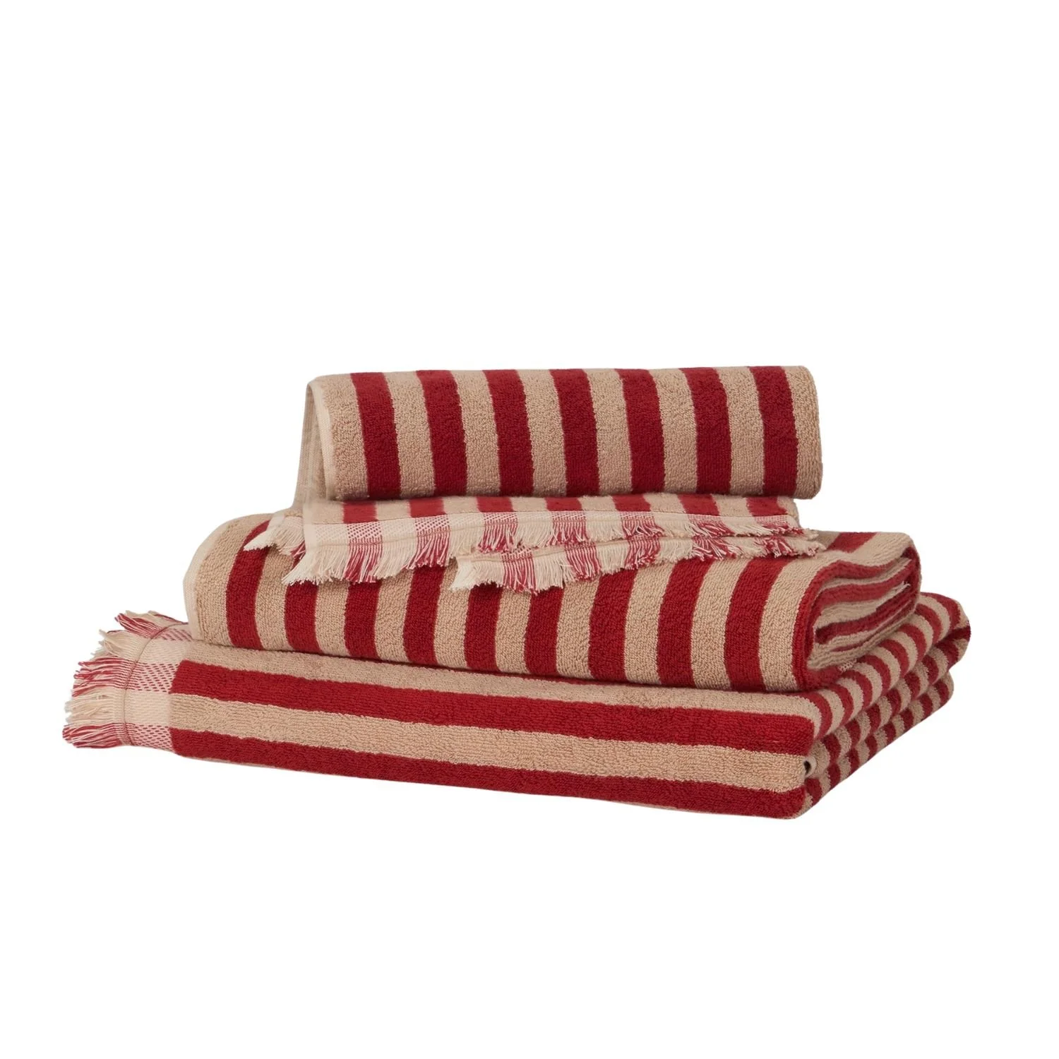
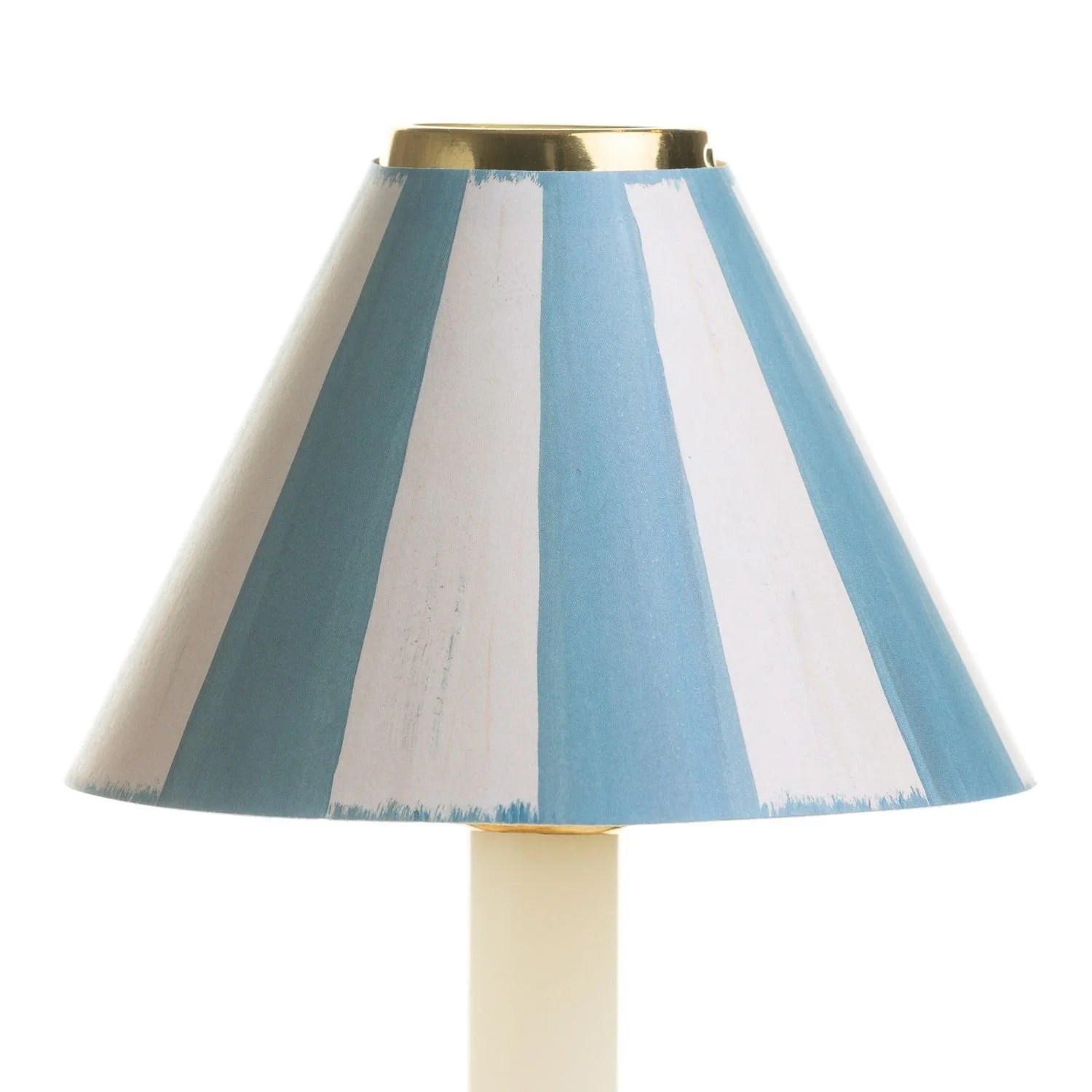
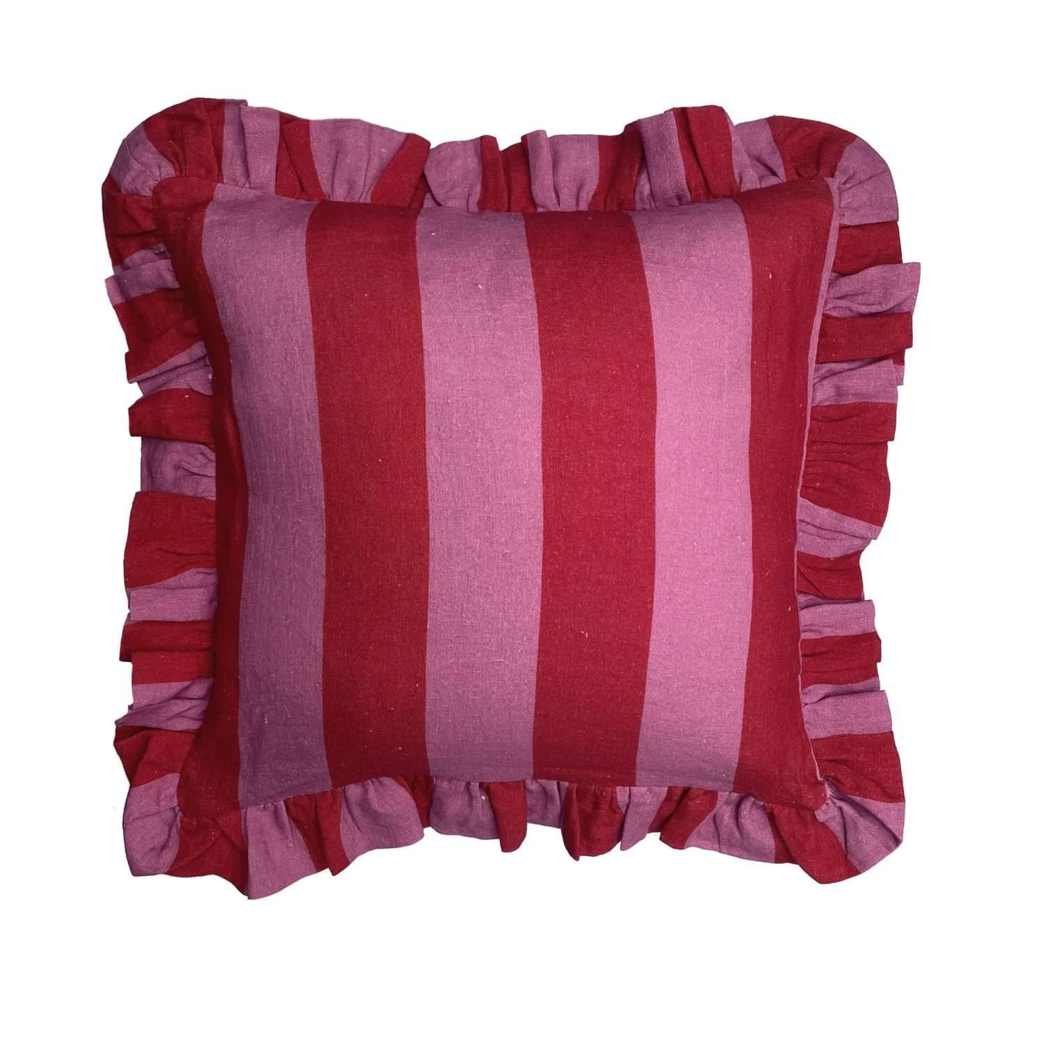
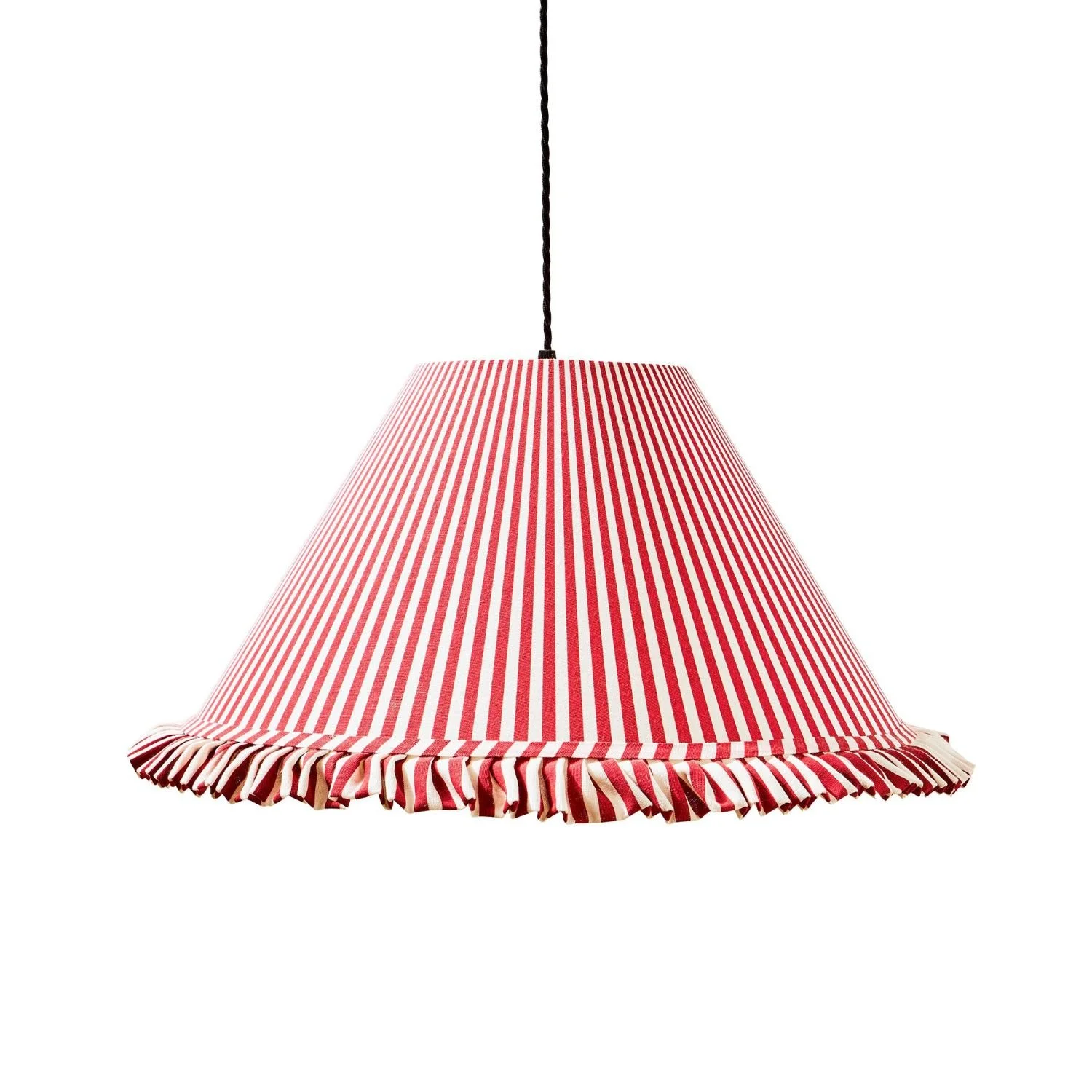
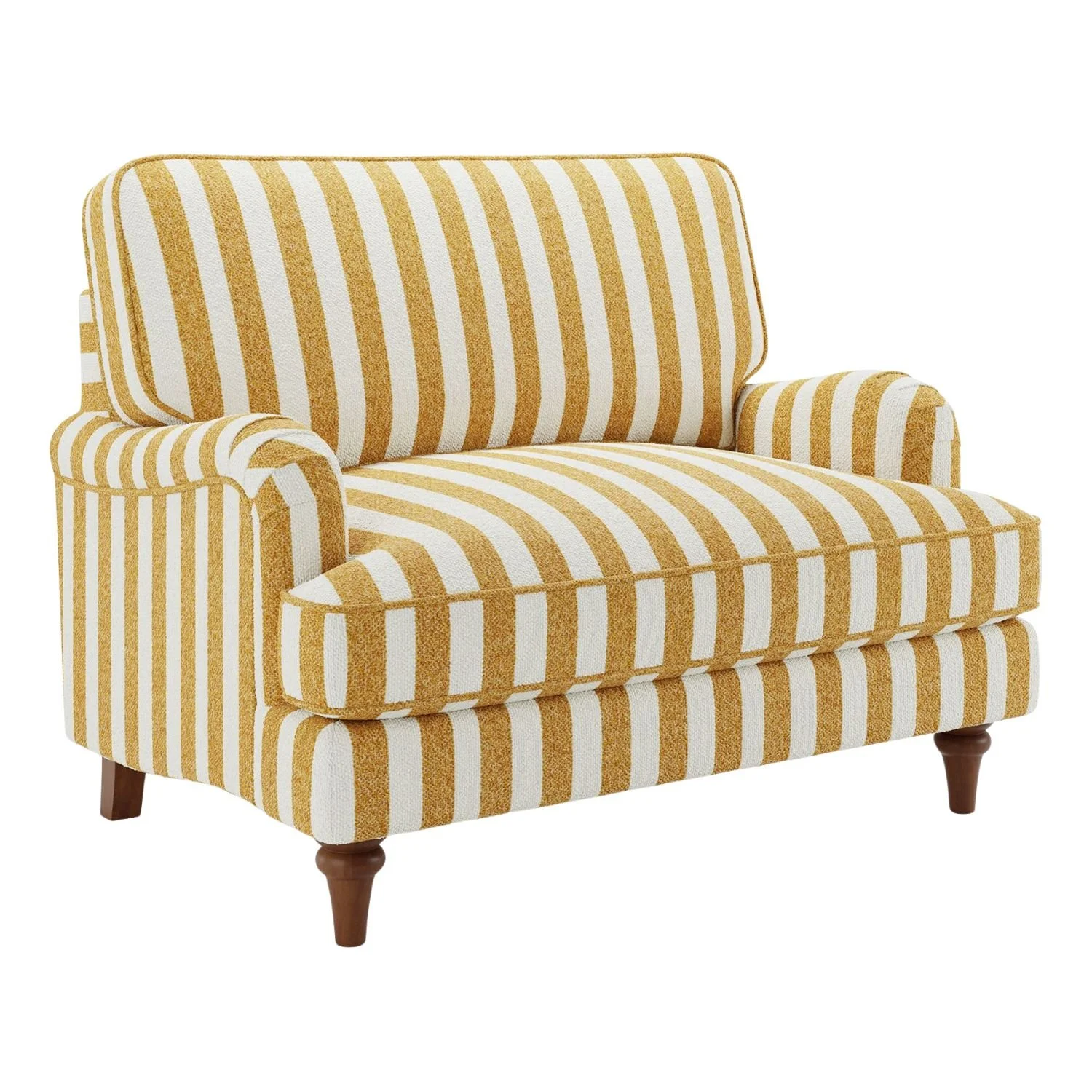
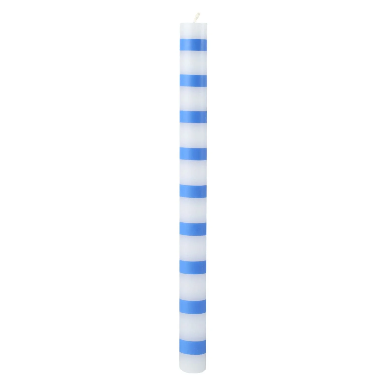
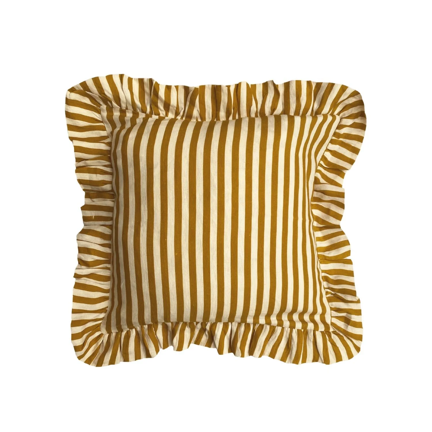
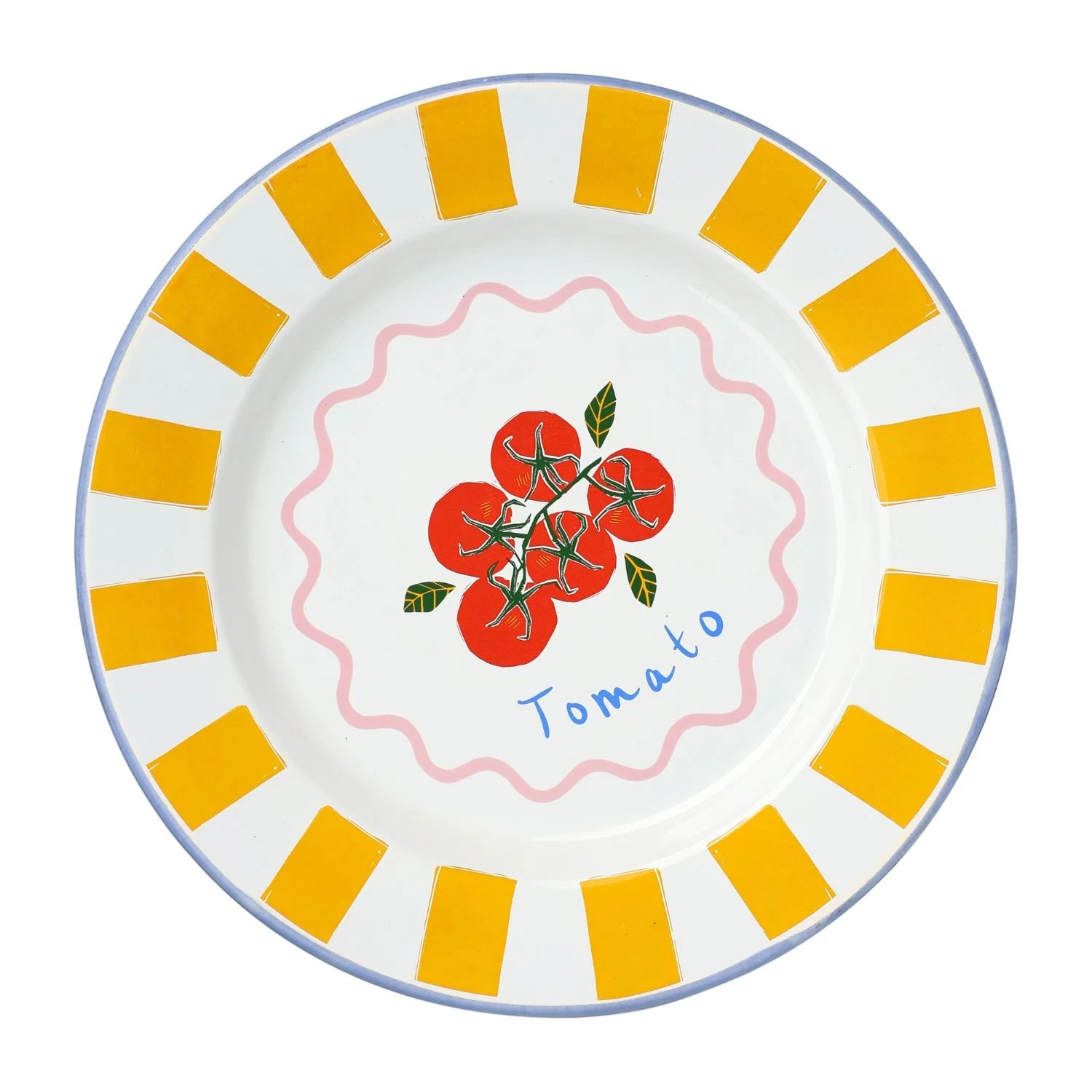
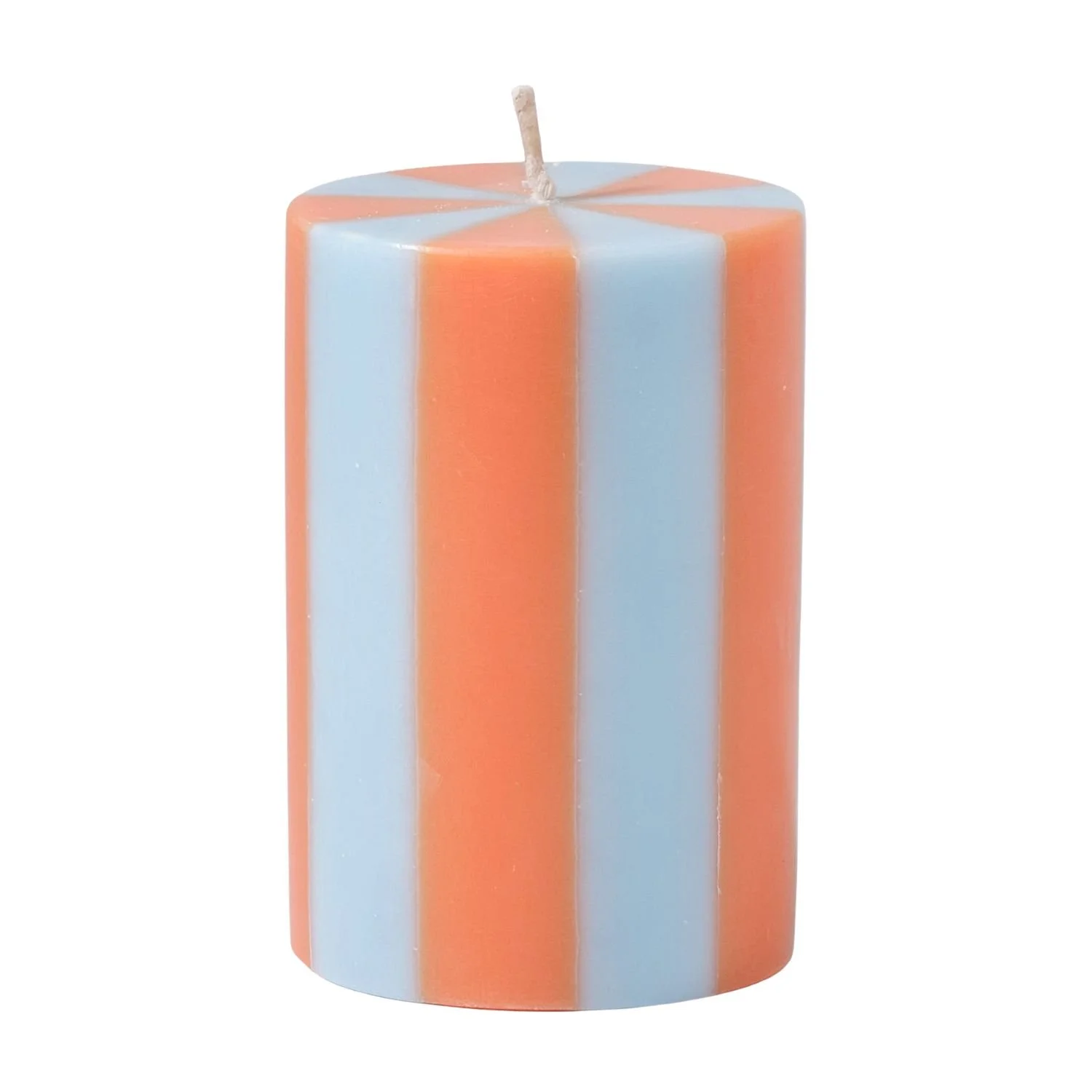
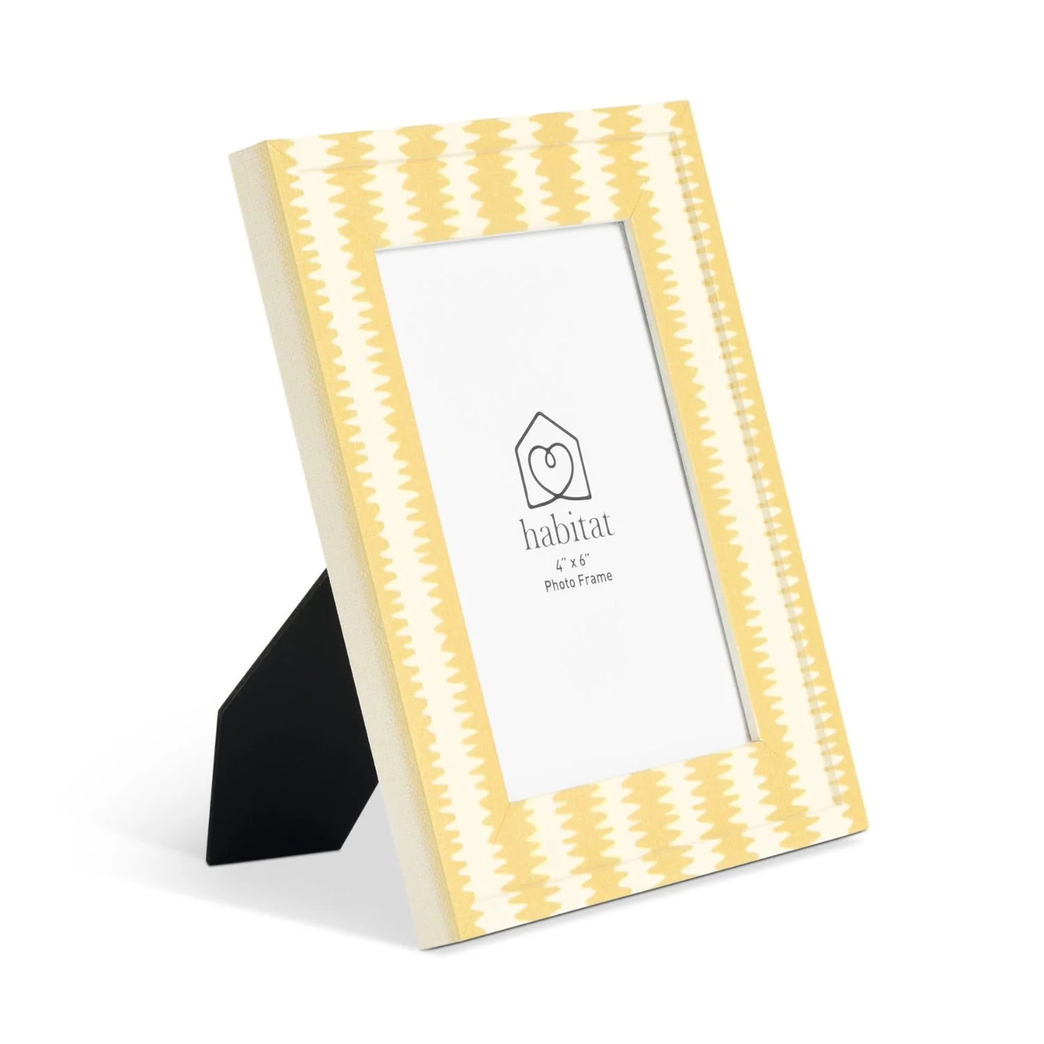
We’ve always associated stripes with spring. Nautical references, coastal ease and that clean, classic feel never really go away. What’s different in 2026 is the execution. Stripes are wider, thicker and far more confident, often paired with colours that would once have felt too much. Red with sky blue, pink with tomato, green with cream. These combinations feel fresh and modern rather than themed. Used sparingly, stripes act like punctuation in a room. You don’t have to go overboard. Much like last year’s unexpected red theory, a single striped detail can lift an entire space. A lamp, a plate, an apron or a cushion is often all it takes. There’s also something deeply nostalgic about stripes. They remind us of holidays, kitchens, cafés and summer tables, and that familiarity brings warmth. In uncertain times, interiors that make us smile matter, and stripes do exactly that.