Label Love: The Highland Soap Company’s New Look
So, when I received an invite to preview The Highland Soap Company’s new look, I’ll admit I was a little… hmmm about it.
Really? A rebrand? Would it just be a polite tweak? A gentle refresh that still left it sitting, in my mind, somewhere close to Scottish twee — albeit with some mightily good lotions and potions I’ve happily used in lovely Scottish hotels over the years.
Well. A rebrand is no small undertaking. Creating the core design is only scratching the surface — it’s stretching that identity across every touchpoint that causes the real headaches. And when you haven’t touched your look in 30 years, have a product range as broad as Highland Soap Company, and need it to work across everything from bottles to boxes to website and store fascias… that’s when it becomes a serious piece of work.
Speaking to Managing Director Archie Macdonald at the launch, there’s real momentum behind it. A new multi-retailer deal in Mexico signals global ambition, and this rebrand is clearly designed to carry the brand far beyond Scotland.
Importantly, nothing inside the bottles has changed. The formulas — and those signature scents — remain exactly as they were. And rightly so. They speak for themselves.
What’s the look?
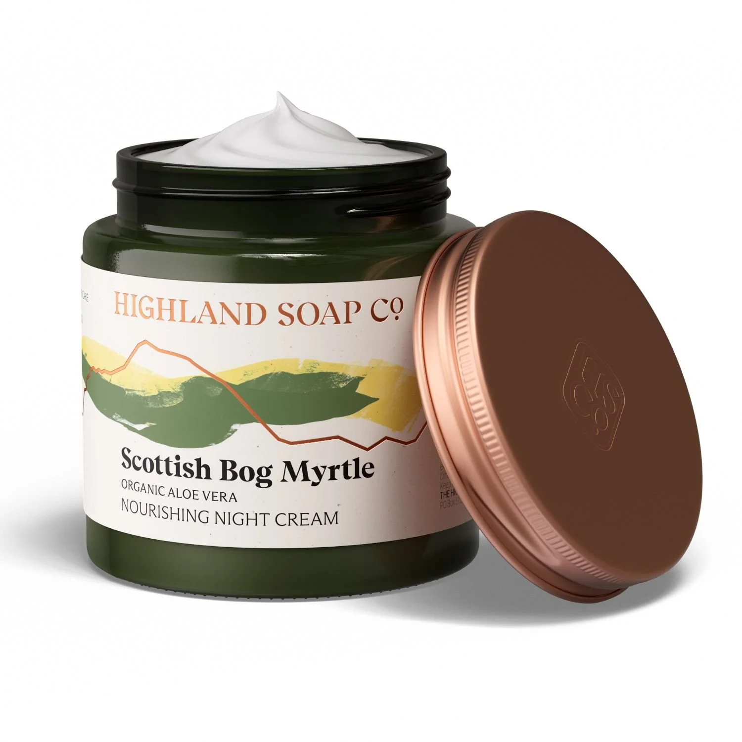
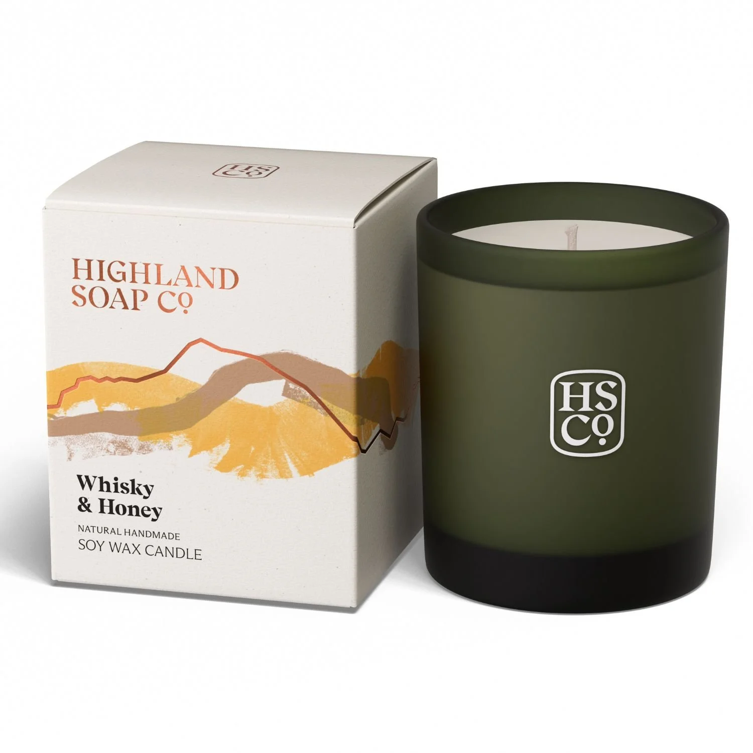
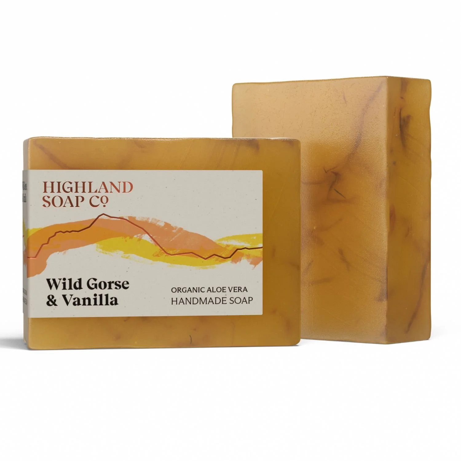
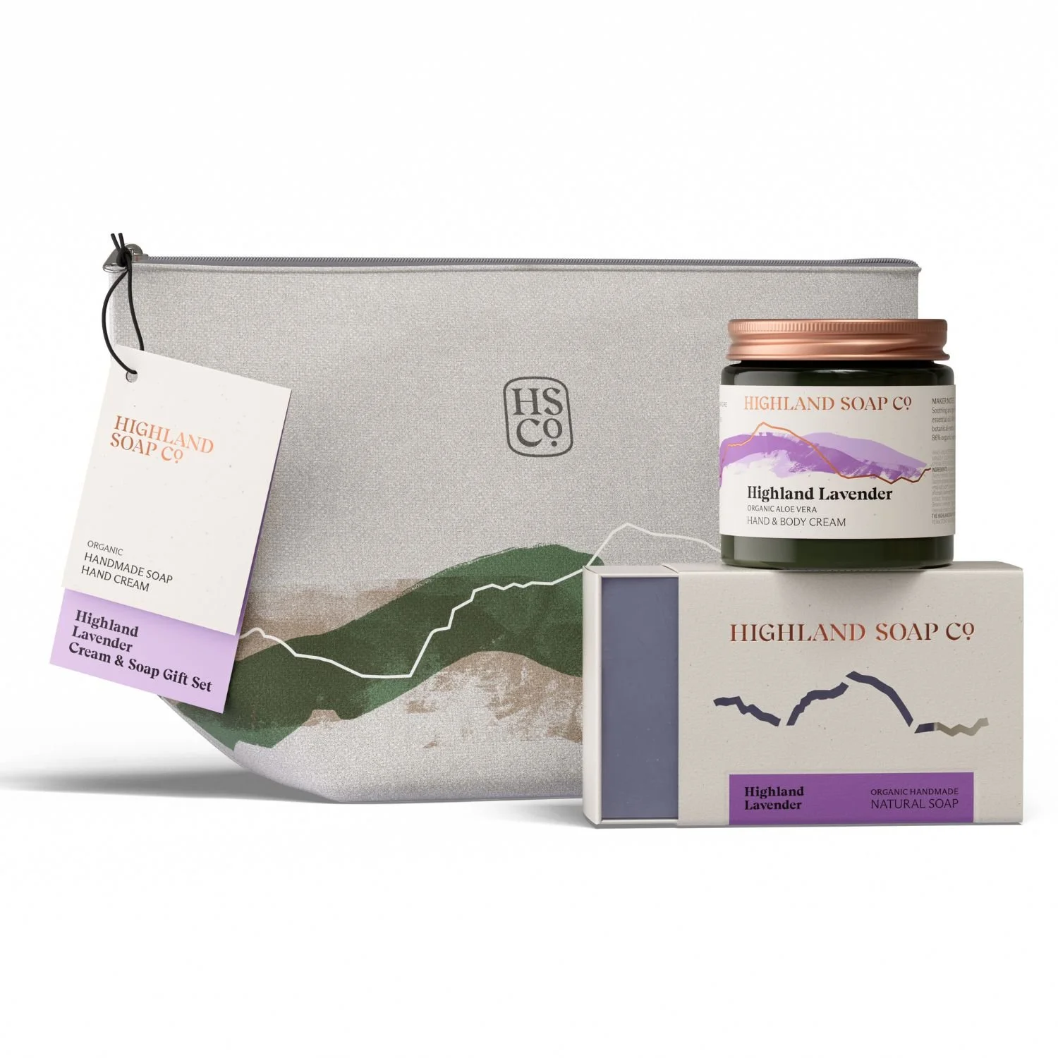
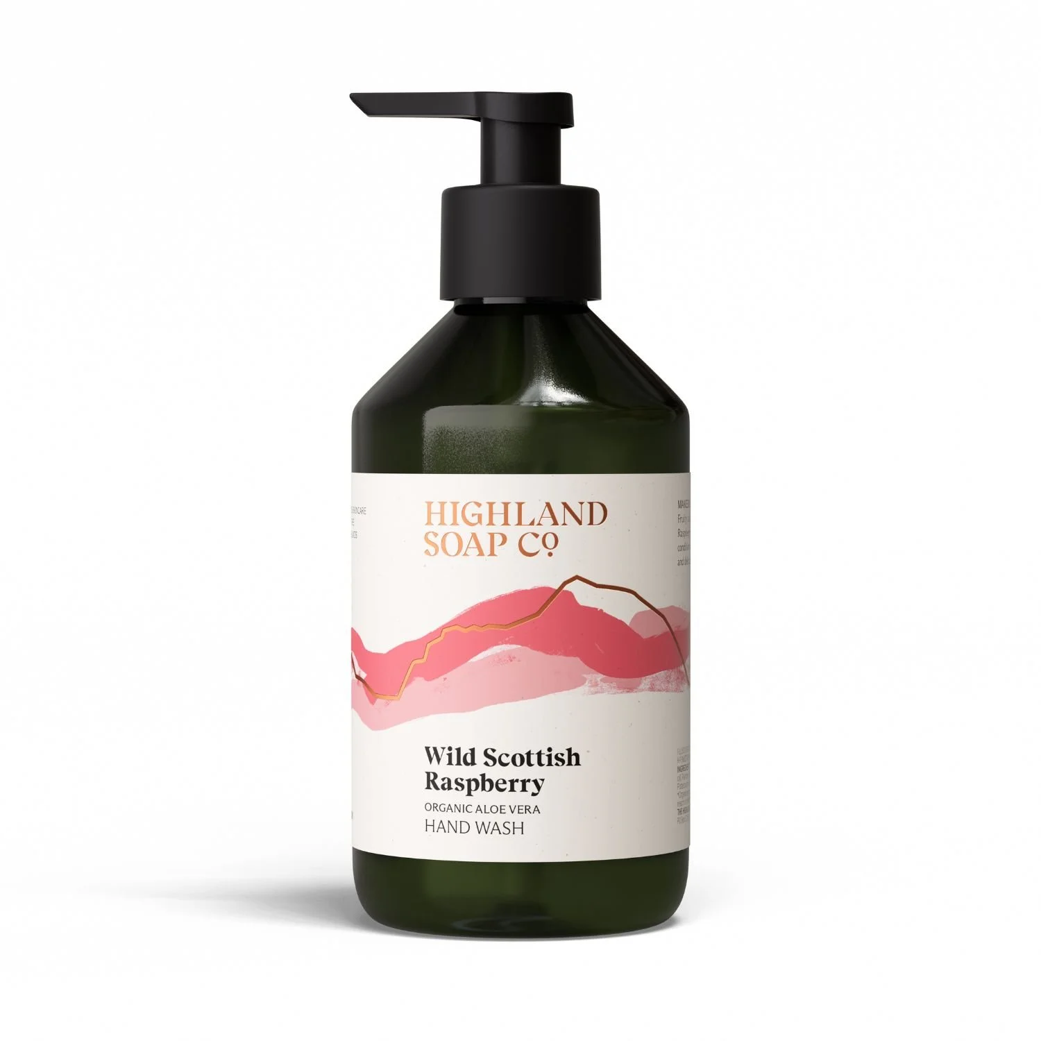
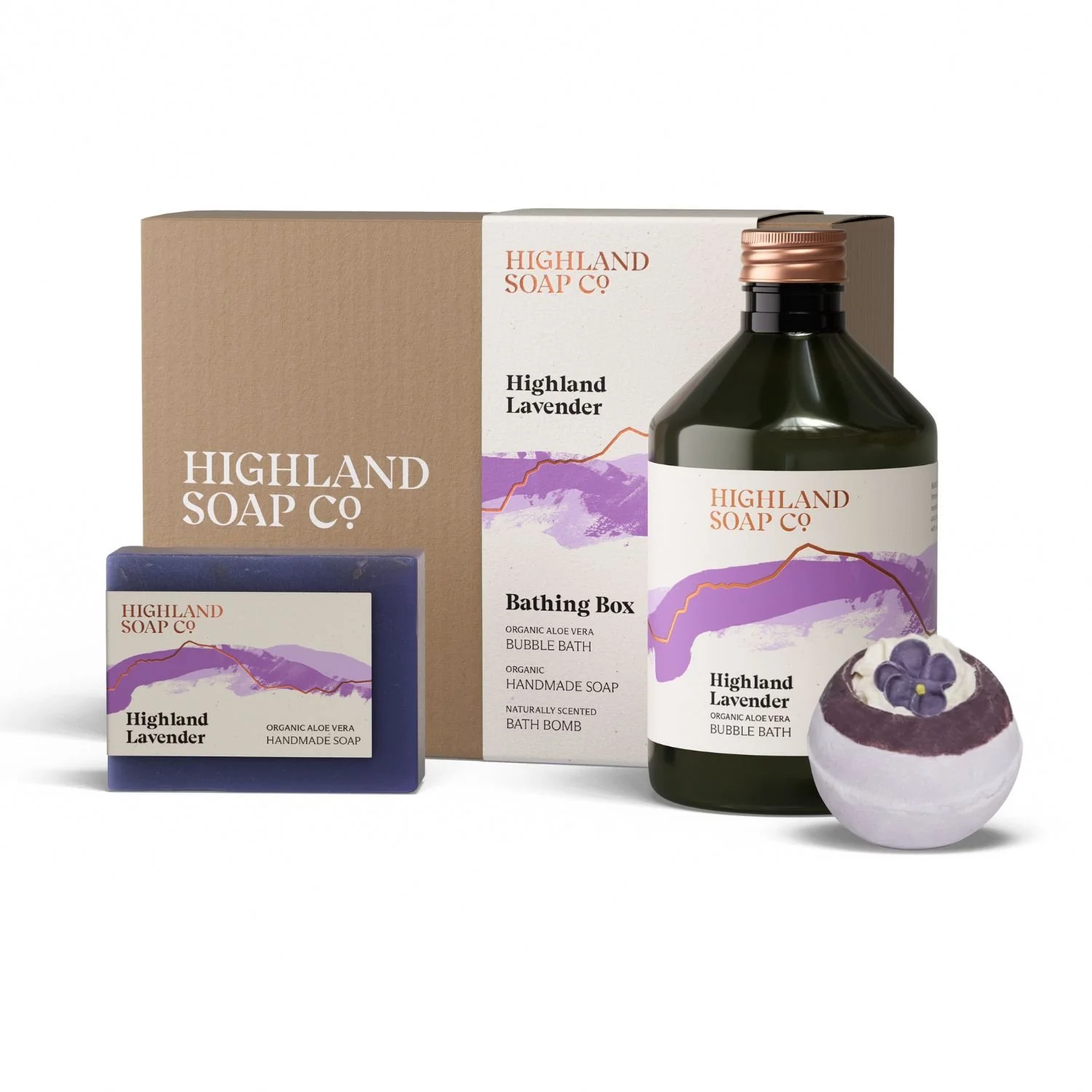
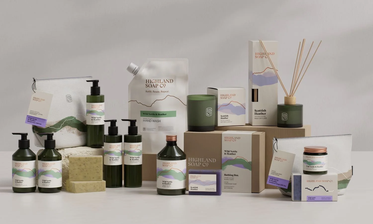
At its core, the new identity is about stripping things back. Created by Freytag Anderson, it centres around a refined visual language inspired by the Highlands themselves — and quite literally, by Ben Nevis, whose outline becomes the anchor point across the range.
Built around the idea “The Highlands. In Essence.”, the redesign captures that feeling of space, calm and clarity and translates it into something more confident and contemporary.
As Daniel Freytag explains, “This went beyond packaging… it was about defining the brand through its connection to place — and letting that story come through in a way that feels contemporary and confident.”
There are hand-painted textures, a refined colour palette and a subtle skyline motif that roots everything firmly in place — without leaning into cliché.
The move to distinctive green bottles, new shapes and expanded labels brings a clarity that wasn’t there before — not just visually, but in how the brand communicates its organic ingredients, natural fragrances and low-impact approach.
Crucially, the system has been designed to flex. Freytag Anderson approached the identity with expansion in mind — creating something that can easily accommodate new ranges as the brand grows.
Why we like it
Well, it doesn’t try too hard. This is a brand that could easily have leaned into cliché — tartan trims, overworked Celtic motifs, the usual shorthand for “Scottish”. Instead, it’s done the opposite. The Highlands are still there, but they’re distilled into something quieter, more modern and globally relevant.
And that’s the clever part. It respects where the brand comes from — quite literally grounded at the foot of Ben Nevis — while making it feel entirely at home on a bathroom shelf anywhere in the world.
As Archie Macdonald puts it, “The aim wasn’t to change who we are, but to express it more clearly.”
For those of us who maybe had Highland Soap Company mentally filed under “nice, but…”, this is the shift that changes that perception. Same beautiful formulations. A much stronger story.
So yes — watch this space. If this is the foundation, the additions that follow should be very good indeed.
The Hood Edit: Our Six favourites